Volumetric light – Understandig light in 3 dimensions
What happens when light shines through objects in hazy air and gets partially blocked by transparent, coloured surfaces?
Let’s experiment with theory of volumetric light. What happens when the light rays become visible because of light scattering which occurs due to haze or dust? Light turns into a visible 3-dimensional shape.
And even more interesting; what if semi transparent, coloured material occurs in some areas and partially blocks the light beam?
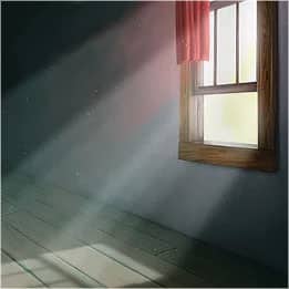
I bet most of you have painted a window with the sun shining through, or beams of light shining through the canopies in a forest. It’s quite interesting studying to understand how this works.
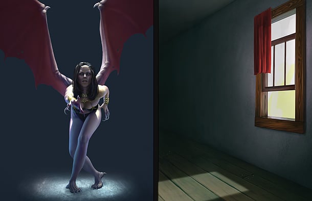
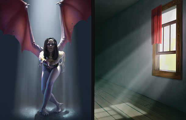
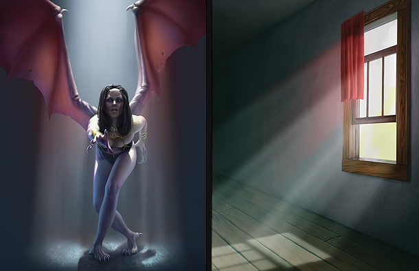
We will follow two different examples throughout this tutorial; one of them is the classic window-scene with the sun shining through the glass, and with coloured drapes to illustrate what happens when light gets influenced by this. The other example will show a winged fantasy creature, with the silhouette of the character creating interesting shapes of light in mid air, and the thin membrane skin on the wings to work the same way as the coloured curtain in the other example. Even if we are following two completely different scenes and settings, they are still sharing the exact same theory and basic guide lines.
You can even use the same technique to alter photographs.
What is important to keep in mind throughout the process of painting volumetric light is obviously to think in three dimensions. I will show some examples of getting aid by using simple help-lines. Make sure to keep the help-lines in separate layers, so that you can easily hide and show them. It’s also important to keep the light and shadows on separate layers.
Step 1 – Concerning 3D in 2D
When painting 3D in 2D you are basically trying to emulate realism, but you don’t have to go all the way and do it perfectly. The important thing is that the end result looks good. If you go for full perfection, I suggest using 3D software.
Thinking of the mid-air beams of light and shadow as actual physical objects is a good way to start, and for a painter that is what it is; shape.
Step 2 – Starting out flat
I prefer starting out with the characters and objects in the scene pretty much done with high lights and self shadowing, but I leave the surroundings quite flat and almost completely covered in shadow. This makes is easy for me to add light, and leave the original surface as shadowed area.
Step 3 – Setting the light sources
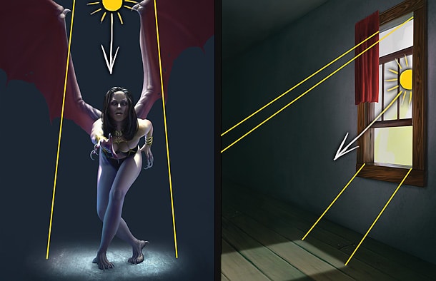
As I have the characters already painted at this stage, I also have an idea where the main light source is coming from. If I can see the light source, I usually make sure to leave a mark here on a separate layer as a point of reference. If the light source is out of sight I tend to stick with a set direction, unless I’m looking for some experimental angles. Let’s keep it simple this tutorial.
To start with, I painted a circle on the ground on the fantasy themed painting, and a square on the ground on the other example in a separate layer with “soft light” as blending mode. This makes a good base for the illuminated areas on the ground, and I use bright colours, close to white values.
This is to roughly show the area affected by the light source. As you can see, the light source is located directly above the character in the fantasy painting, and from the sky, left on the painting with the window.
Step 4 – Help-lines for the shadows
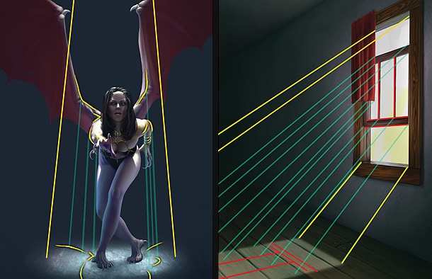
This part is important to get somewhat right, but no need to construct the perfect 3D shadow. I suggest creating a new layer to keep some help-lines for perspective and direction of the light beams in-between the objects/characters and where the shadow will fall. If I can’t see the main light source, I try to imagine approximately from where it origins, to extruding parts of the objects/characters, and continue this line to where it will fall on the ground and become a reference point for where the shadow will drop. I make sure to do this a few characteristic places, and especially on each side of the silhouette.
Step 5 – Painting the normal shadows
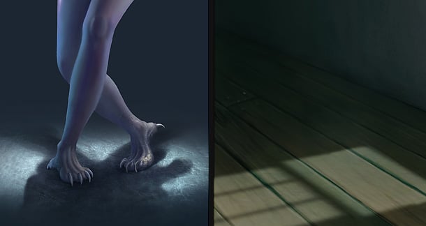
The first rule is that the further away the shadow is from the object that creates it, the more blurry it should be, unless the source is tiny but still very sharp. Keeping a shadow sharp at the base of an object, and blurring it out the further away it gets creates depth. The second rule is; notice that on the fantasy painting the shadow and the dark area around the circle on the ground has got the same values. The same goes for the shadows of the bars from the window in the traditional piece.
Step 6 – Let there be volumetric light
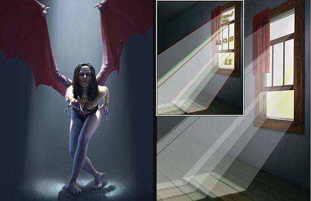
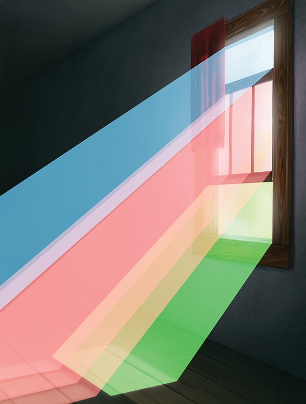
Showing the layer with the help-lines from step 4, I create a new layer in which I fill the air in-between the light source and the illuminated area on the ground, using perfectly straight lines and a soft brush. If the light gets too strong, the opacity slider on the layers menu is handy for tweaking.
Another easy way to do this is to make a perfectly sharp shape with 100% white, do a “Guassian Blur”, set the layer to “Soft light” and turn down the opacity of the layer. Make sure to keep each shape of light in separate layers, or else it will all end up as one shape and you’ll loose the sense of separate layers of light. Each of the transparent squares in the window was kept in a separate layer.
Step 7 – Volumetric shadows
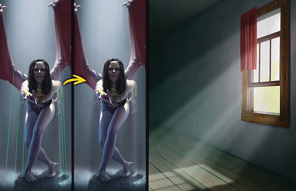
Now we have a base with normal shadows and volumetric light, but we lack volumetric shadow. Objects that cast shadows on the ground, or on objects, will also cast shadows on the dust/haze in mid air. I still keep the help-lines from step 4 and use the easer tool with low flow and a soft brush to gently remove some of the volumetric light I painted in the previous step in-between the objects and the corresponding shadows. Also, note the talons on the wings casting shadow in mid air.
If you did the process of putting the layers of light into separate layers as explained in the previous step, then most of the volumetric shadows should already be there, but adding some additional darker strokes to underline this effect doesn’t hurt.
Step 8 – Skin membranes and coloured fabrics
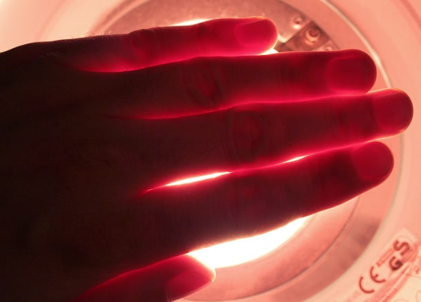
Skin is transparent, and if you look at your hand in front of a strong source of light, you will see that the light will be led through the space in-between your fingers, even though you’re blocking the light completely. The colour is strong red and orange, and this is the key to make thin skin membrane look transparent when lit from behind. The cloth works in a similar way, when lit from behind, even though it’s not an organic material, the surface will be lit on the opposite side of the light source. As the wings of the creature have got “fingers” between the skin membranes, I make sure to keep these areas darker, but with quite a bit of red colour to give it the impression of transparent, illuminated skin. Also, showing some veins is cool.
Step 9 – Colour-influenced air
As some of the light penetrates the coloured material, it will influence the hazy air with the same colour as the material. I simply colour-pick the same colour of the membrane/material and do the same thing as when painting volumetric shadows, only vaguer. Doing this adds to the final touch of realism, and its fun to play around with different coloured materials. I tend to imagine this similar the coloured spot lights at rock concerts, only toned down, leaving only a sense of the colour in the air. Kyrgyzstan Experiment with the layer blending modes to see what fits. On these examples, I used “color” mode.
The shadows from the coloured materials should also have a slight tint of red, so I added this to the ground in the fantasy piece.
Step 10 – Dusty details
To create some extra shape and perspective to the painting, I think it’s nice to add some larger floating dust particles, or flying insects to break up the light beams. The volumetric shadows from the particles and insects should all point away from the light source, and helps creating a nice sense of space and perspective.
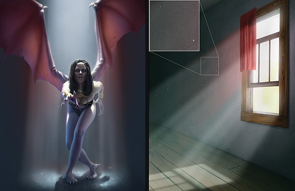
Adding some noise grain to the volumetric light layer makes it look more natural, so don’t be shy to experiment with this. Personally I simply add some normal noise from the standard Photoshop filters with a normal blur at the end.
Also, if you are a really into detailing; going over the entire piece, filling in tiny beams of light penetrating through gaps in the illuminated surface is fun.
Pro tips 1
The importance of backing up your work is something you can’t hear too many times, and also saving in process steps of your pieces is important if you plan on writing tutorials. So, why not combine the two and save PSD-versions of your piece as you go along in a separate folder? If you have limited disc space or simply don’t want to waste space, then simply save it as TIFFs, (preferably) or flattened jpeg version with compression quality set to maximum.
Pro tips 2
If you’re planning on sending your work to clients or to a printer, make sure you have “cleaned up” your image first. Make sure you don’t have any extra channels or paths lying around, and if saving as TIFF format, save with Image Compression set to “NONE”. No LZW, Zip or jpeg compression as this might result in problems at some printers. Also, to check your CMYK values without altering the RGB values, toggle CMYK/RGB preview mode on and off by pressing CTRL+Y.
Shortcuts (Photoshop)
Redo last filter
Handy shortcut for repeating last used filter.
Ctrl+F (PC)
Apple+F (Mac)
Navigation
The first shortcuts a digital artist should know and learn by heart.
Space = Move
Ctrl+Space (PC) / Apple+Space (Mac) = Zoom in
Ctrl+Space+alt (PC) / Apple+Space+Alt (Mac) = Zoom out