Old style pin-up art the new way
See the creation process of a modernized pin-up artwork and get the know-how to do it yourself.
Painting pin-ups can be a whole lot of fun, no matter if you go for the old-school vintage cheese-cake kind of look or if you want to add a modernized twist to it. You don’t have to be a pin-up artist to create pin-up art, but to achieve the very special look and feel, you will need to spend some time researching the old pin-up masters like Alberto Vargas, Gil Elvgren, Billy de Vorss, Joyce Ballantyne, Zoe Mozert, Edward Runci, Earl Moran and Haddon Sundblom to mention a few.
Keep in mind to simplify, and especially things like folds on clothing and skin. Even though a hand looks realistic with the nicest of details, it might not work for the pin-up genre. Smooth things out, and aim for simple approaches.
Play around with anatomy; Pin-up girls are most likely to have longer legs and thinner limbs than realistically and you can push their curves quite far to make them more full bodied.
Step 1 – Back-story and rules
The term “pin-up” was created in the early 40’s and origins from images with erotic content that you could rip out of magazines and newspapers or from calendars that you could “pin-up” on the wall.
I believe the reason why this genre of art still appeals to so many people is because it’s kind of sarcastic, naive and timeless. You can still create modern pin-up art based on the old guidelines.
Three things about pin-up art:
- The stars of the piece are the legs; they should be long, slender and smooth, have grace and a sexy silhouette and posture.
- Facial expression; innocent faces, and they are mostly depicted either smiling showing perfectly shaped white teeth, or having a surprised expression which is often linked to slapstick kind of comedy situations; like panties “accidentally” sliding down or skirts getting stuck in a fencepost or a twig.
- Smoothness; details like cloth folds or wrinkles in skin can make the painting too complex and realistic and might yield from the pin-up appearance.
Step 2 – Sketches
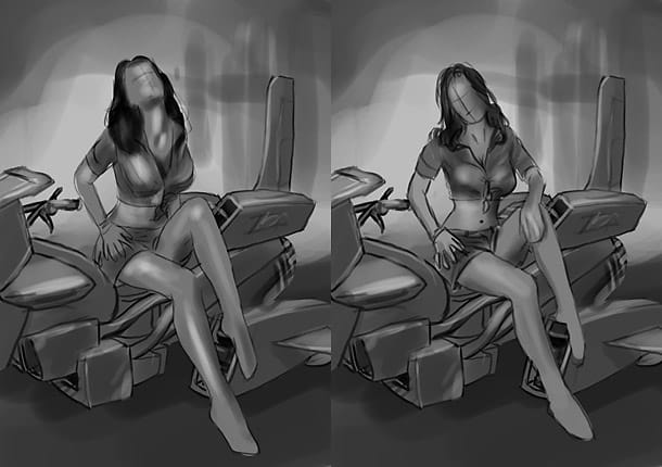
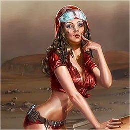
Based on the client’s description, I started out making a couple of sketches for them to decide upon. The theme was to be a classic looking Gi-Jane kind of character, with a sassy camouflaged uniform with red, Martian kind of colours, and a scarified Martian terrain for the background. After a few experiments in sitting poses, the client suggested a standing pose to show off her legs, which is a good call for an illustration for this purpose. After all; the legs are one of the most important features.
Step 3 – References
Even though pin-ups don’t have realistic anatomy, it’s still important to look at reference photos. If you have a helpful friend; set up a quick photo shoot so that you have something handy to look at while painting. Only real reference photos can aid you as to how light and shadows works, and how skin and fabric folds.. Also, having access to a good reference library doesn’t hurt. For this piece, I found out that it’s almost impossible for a real person to hold this pose. So, the reference doesn’t have to be perfect, just something for guidance.
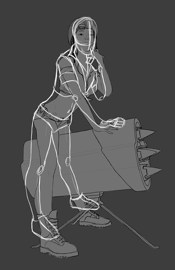
Step 4 – Base sketch
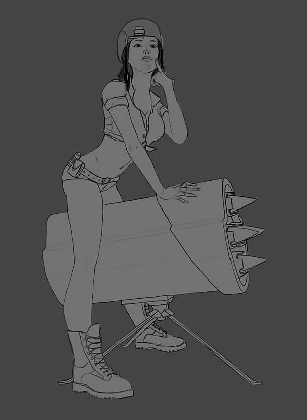
I started up in medium resolution to free up resources for making the sketching process as fast as possible. Starting out too big can put a damper on creativity, even if you don’t think about it yourself. To get the basic body shape up, I used the grid technique to copy some of my references to get her anatomy in right proportion before I transformed the sketch into a more extreme posture and body shape. Her legs are longer than realistically, her waist is thinner, arms slimmer etc.
Step 5 – Get in shape
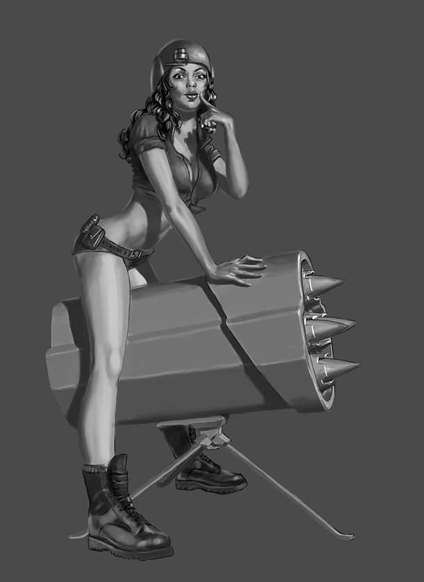
Having the sketch ready with a solid coloured blocked in background, I turn on “Lock Transparent pixels” in the “Layers” window. This way I can’t paint outside the existing pixels in this layer. As I prefer working with shape before colour, I start off in grey-tones only. Using a hard edged brush exclusively, I go over the entire character with rough brush strokes. I don’t apply any details at this point. I’m looking at different references at the same time to get light and shadows somewhat right.
Step 6 – Colour me
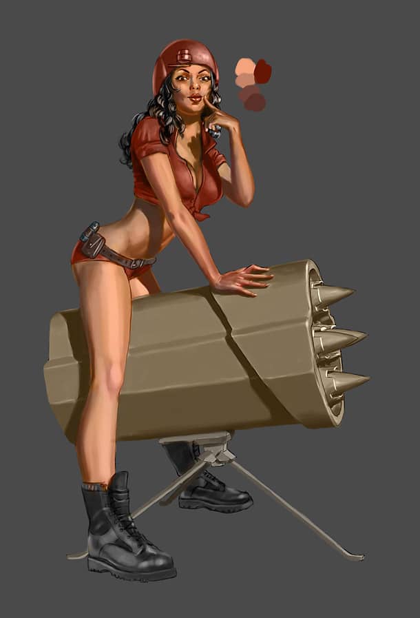
Let’s apply some base colours! I rarely spend much time creating a palette at this point as values and colours will change during the process. I made a temporarily mock-up palette to colour-pick from (press “Alt” in Brush Tool mode), I applied this onto the character with my brush set to “Colour” mode. This will tint the grey-scale base version of the painting. Now, you can easily see that my values weren’t as dark as they should have, as it looks flat. This is why it’s important to check both your grey-scale and colour values.
Step 7 – Colour me again
Before starting the first round of rendering, I scaled the painting up to a larger format.
You don’t need fancy brushes to render art. A normal hard edged brush will get you far, and it also embeds your personal characteristics in each brush stroke more than soft brushes. Change the “Brush tool” back to “Normal” mode and start rendering the character over and over again. This can be tedious, but this is what makes the painting. The more time and effort spent, the more you and your viewers will enjoy your art. I made sure to introduce vague colour variations throughout the piece to prevent monochromatic colours. Remember; skin tones are usually darker than you think.
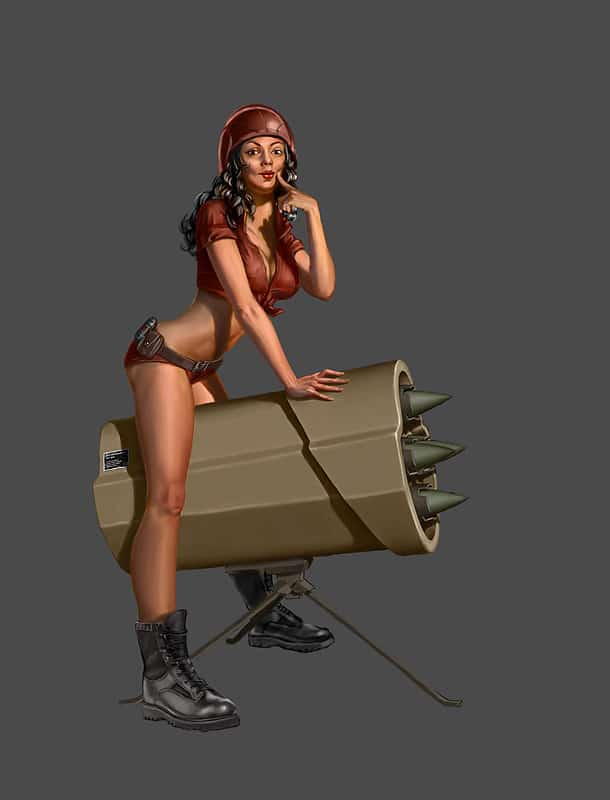
Step 8 – Background
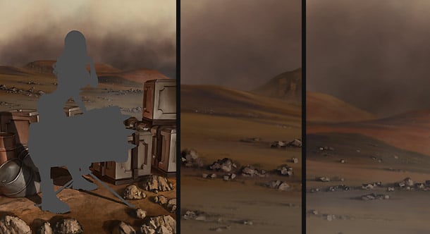
Backgrounds are not uttermost important for the pin-up genre, but if you do include one make sure it doesn’t take attention away from the girl as she should be the star in the painting. It’s important to introduce the background before the final decision of the overall colour-scheme so that the character can mesh better with the environment. I kept the brush strokes very rough just to hint the jagged rock formations. I also added some crates and barrels to populate the canvas.
Step 9 – Face and hair
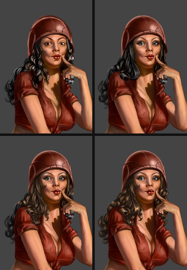
The face and hair is obviously one of the major characteristics for any pretty girl. I made sure to spend some time on her face as there are no shortcuts here. Look at old pin-up paintings for inspiration in addition to your own references. First, the hair was roughly shaped out with a hard edged brush, then refined with a dotted hair-brush and later single hard strands of hair was added. Start with a dark base and work yourself upwards towards brighter values, layer by layer of hair. This also applies for blond hair.
Step 10 – Makeup
I suspect that female artists have a head start to us guys when it comes to applying makeup to characters. Still, I did my best and chose to keep the makeup on a separate layer so that I can easily do changes to her face without having to send her back to the makeup room. Add a layer with the blending mode set to “Hard light” and softly apply the makeup. A rosy glow in her cheeks and chin, some eye shadow, and finally; mascara applied on another normal layer.
Step 11 – Refine the silhouette
One of very few purposes I can think of for the smudge tool, is for refining the outlines of my characters. Using a semi soft brush with “Strength” set to fairly high works nicely, and makes the silhouette appear semi soft. Make sure to edit the silhouette so that is shows interesting lines and curves. Photoshop’s “Liquify” tool is great for major tweaks
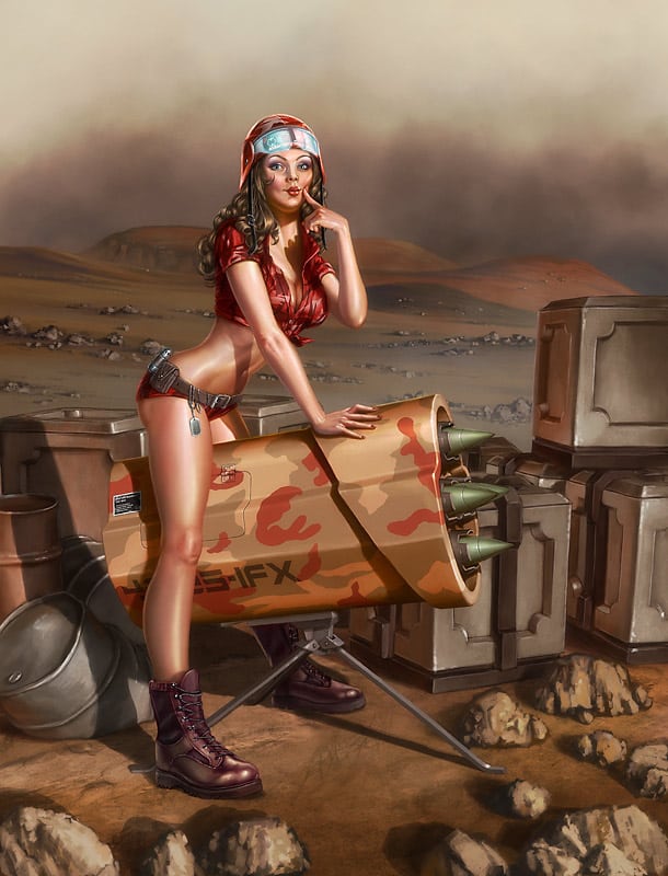
Step 12 – Camouflage me
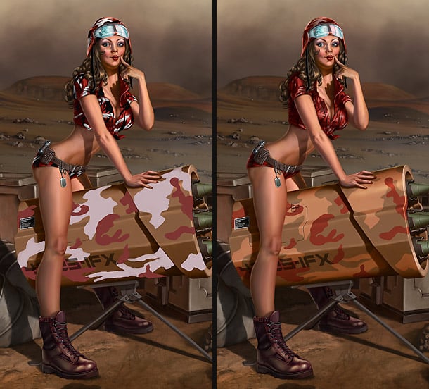
Since our Gi-Jane character is located with the infantry stationed on the planet of Mars, her camouflage needs to match her surroundings. After refining her clothes, I started painting the camouflage on two new layers; one for her outfit set to “Hard Light” blending mode and 50% opacity, and another one for the rocket launcher set to “Overlay” blending more, and 80% opacity.
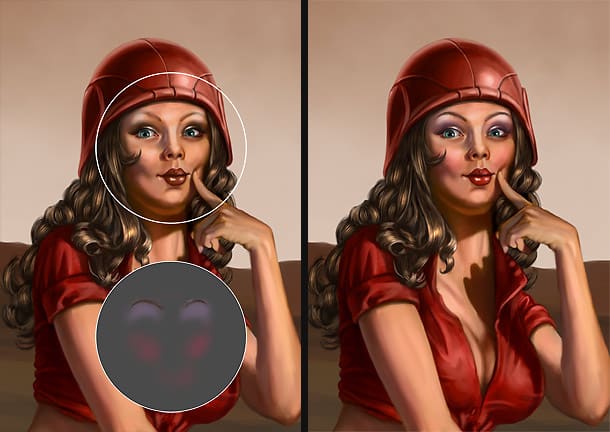
Step 13 – Get a sweat going
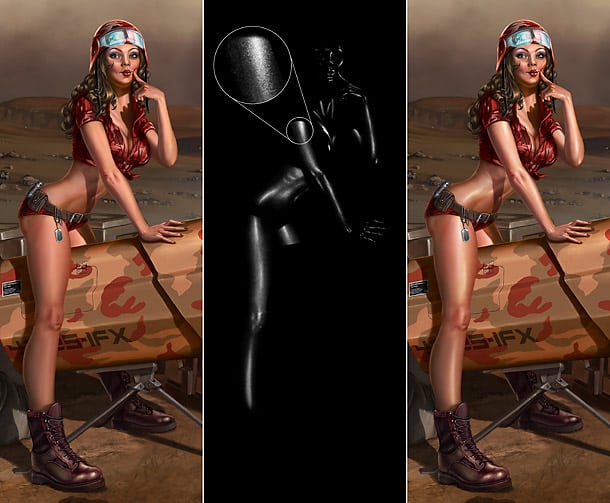
For our soldier girl to look like a hard working gal, she will require some additional work to her skin. Sweaty skin is tricky, but one way of achieving a similar look is by painting the highlights of the wet skin on a new layer set to “Overlay” blending mode. Use “Brush Tool” with a textured noise brush, white colour only along with Eraser Tool. Use no dark colours. Sweaty skin looks noisy because of skin pores and when pearls of sweat attach to body hair. (The black on the centre example is transparent.)
Step 14 – Final tweaks
The last thing that should be done is going over the entire piece, zoomed in and armed with a smaller brush to fix minor glitches and errors. I also added more backlight bouncing off the silhouette of the character to connect her more to the background.
Step 15 – Apply soft glow
Apply a soft glow effect by collapsing all the layers into a new layer by pressing Shift+Ctrl+Alt+E. Make sure this layer is on top and run it though “Filter/Guassian blur”. Then set the layer blending mode to “Linear dodge” and layer opacity between 20 and 40%).
Step 16 – Grain and noise
As digital art often result in very clean colours and values, I prefer applying a vague layer of noise on top of my paintings.
- Add a new layer on top with the RGB-values 128, 128, 128.
- Run “Filter/Noise/Add Noise”. Set the amount all the way up to 400%, Gaussian.
- Run “Filter/Brush Strokes/Spatter” a couple of times.
- Run “Filter/Blur/Blur more”.
- Set Layer blending mode to “Overlay” and adjust the opacity slider down to around 3 to 10%.
- Done!
———————————
Random pro tips
Hide your filters
Using automated filters can be your worst enemy. The trick is to use it subtle so that the viewers don’t notice it. Blend the layer with the filter effects by playing around with layer blending modes and opacity, and textured brushes will cover up the effect, and the effect itself will help adding texture to your work. The best advice is naturally to do everything by hand, and you will also appreciate your work more that way.
Mess it up!
Digital art can easily look too smooth and artificial. After finishing a painting, why not create a layer on top of all the others where you use a textured “randomization” brush? This creates interesting inaccuracies and the impression that your painting contains more details that is actually does. Play around with the brush creation options and find a setting that suits you. Brushes like this usually works great especially for highlights.
Random shortcuts
Straight lines
While using any painting tool, hold “Shift” to automatically draw a straight line between two points.
Paint back the past
Done some brush strokes you regret since last save? Hold “Alt” while using “Eraser Tool” to paint back information from the last saved state of the file.