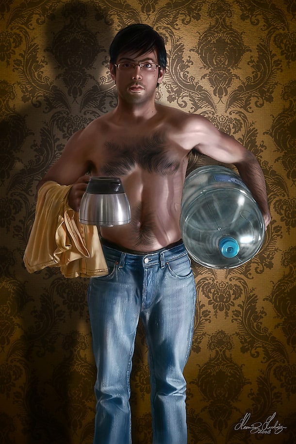
Henning’s 101 : Materials
Having an understanding on how different materials works will add extra flavor and texture to your art. Get a quick walk through here.
(C) Henning Ludvigsen
Painting is all about somewhat tricking the viewers to believe what they are seeing. What is it that makes us perceive that we’re looking at an object made out of glass, cloth, wood, ,metal, or even different qualities of the same material? As an artist, you have to convince your audience to accept what they’re looking at, and there are many ways of emulating different materials and surfaces on a flat 2D canvas, both when done digitally or traditionally.
It’s up to you to decide how deep down the rabbit hole you want to go; do you prefer to simplify and still achieve the look of the materials that you’re aiming for, or do you want to really understand how things works and why the different materials act the way they do. For example; understanding reflections can be a massive subject of study alone.
Let’s get a little overview by separating the most commonly used materials into four sub-categories; matt, glossy and transparent, shiny and reflective, and organic materials.
Category 1: Matt materials
Soft cloth
(C) Henning Ludvigsen
Fabrics aren’t just fabrics; think about all the different types and qualities you have in real life and try to include these in your art as well. The most fundamental difference between different fabrics is how it folds, in addition to its texture. Thin and soft cloth will have quite small and organic folds, and hardly any strong highlights; merely shadows and light (unless it’s shiny silk, or similar). Remember that light can penetrate cloth and cause subsurface scattering, making the shadows behind illuminated folds glow with quite saturated colours, as seen in some of the dark places on this example.
Thicker cloth (denim)
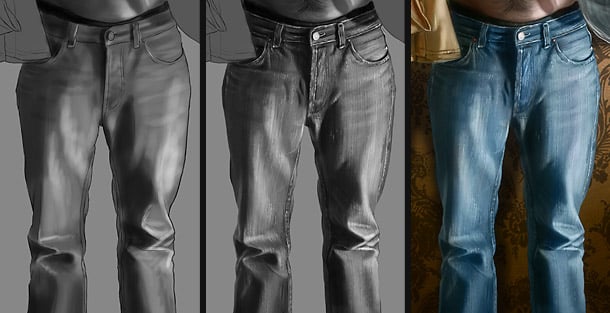
(C) Henning Ludvigsen
To make fabrics appear thick, the key is taking advantage of large, straight, and sharp folds. For example; denim or leather would not look convincing if we used the same types of folds as on soft cloth.
Also, especially on easily recognizable materials, like denim, remember the final round of detailing; the “dirty” blue colour, with soft variations of green, grey and yellow carefully mixed in, and the vertically aligned texture of the fabrics (I used my speckled hair-brush to create the lines in this example). The final yellow/brown thread trimming and studs makes it all come together and create the impression of denim. Always look at references when imitating easily recognisable materials.
Rock
(C) Nick Deligaris
Rock is almost like cloth, with surfaces too rough and rugged to have any major highlights. Focus on details and angles when painting rock, and don’t go too dark on the shadowed areas, as it’s easy to make the contrast too high making the rock to appear noisy and artificial. Nick Deligaris has succeeded in creating a beautifully balanced rock surface in this example. It’s all about taking your time, and holding yourself back with the contrast.
Tree bark
The most important feature to keep in mind when painting tree bark is keeping the highlights very low, because of the complex and rough texture of the tree trunk itself. It will appear realistic if you include richness of details, like cracks and layers of bark. Also, traditional looking tree bark is usually darker than you might think.
Skin

(C) Henning Ludvigsen / Fantasy Flight Games
Skin is fun, and consists of many colours blended together to create the final expression. Mix in cold colours where the skin is thin or pale (underarms, wrists, below the eyes), and use warmer values where the skin is warm or more exposed to friction or sun (nose, knuckles, knees, fingertips). Even tossing inn some vague green, grey, and yellows will make the skin appear more alive. Monochrome colours should be avoided, as long as you’re aiming for realistic skin tones.
Wooden planks
There are plenty of wood types to pick from, but when painting normal, untreated wooden planks, keeping the highlights low is the key. Shiny wood will make it appear either treated, or like plastic. Painting the growth rings can seem as a vast task, but remember that this can be done quite roughly, and even with a speckled or dotted brush in a few seconds.
Rusty metal
Rusty metal works quite different than if it wasn’t rusted. Just as wood, keeping the highlights low will make it appear rough, and is therefore the key to achieve the right feel for this state of the metal.
Category 2: Glossy and transparent materials
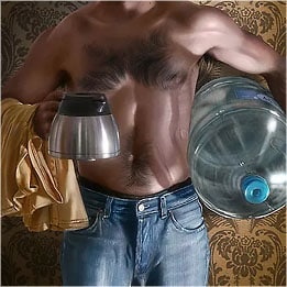
Transparent plastic and glass
![]()
(C) Henning Ludvigsen
Transparent plastic and glass behaves quite similar, except that glass might have stronger and more refraction, distortion, and highlights than plastic. For the water-container in this example, the basic shape was first sketched up to get an overview of its shape both on the inside and on the outside.
To create refraction, a piece of the background, larger than the outline of the container itself was copied into a new layer, and distorted in the areas with the most angle versus the background by using the liquify filter in Photoshop CS, and then cut to fit the shape of the container. This to connect the transparent container with the background. The refraction layer was blended with the bottle using the “Overlay” layer option, and opacity set to 30%.
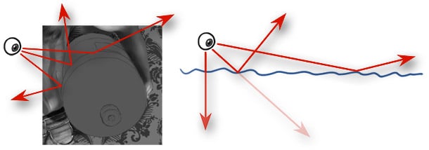
To paint realistic glass or hard plastic, strong highlights and contrast is the key. Try to imagine the angle from your point of view towards the surface of the object to see which direction in your “scene” it will bounce off to figure out what will be reflected in that area.
The more directly you’re looking towards a flat transparent surface, the more transparent and less distorted it gets. At sharp angles, you see more reflection, less transparency, and more distortion. This is why looking directly down into water makes it seem clearer than looking out in a sharp angle towards the horizon where you will see more reflections instead.
Because of its complexity, reflections don’t have to be perfect. As long as you manage to achieve a desired effect to work as an illusion of reflection, you’ve succeeded.
Wet and slimy stuff
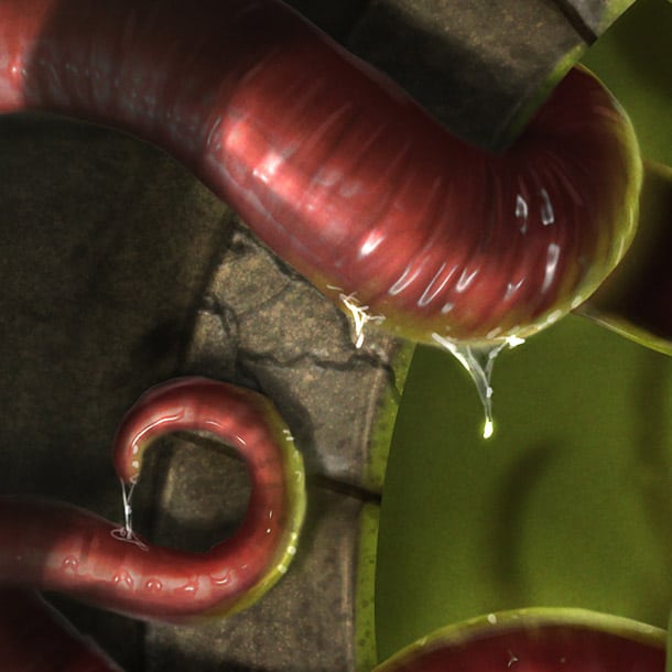
(C) Henning Ludvigsen
Play around with strong highlights when painting wet or slimy things. This also requires planning out shapes well, as all angles on the surfaces has to correspond to the placement of the light source. Think of this like painting glass, only focusing on highlights almost exclusively.
There are simple ways of achieving similar effects in Photoshop, by taking advantage of the “plastic wrap” or “chrome” filters, and then blending these with background layers using different layer blending modes. These filtered effects can also be used as a guide for painting, and avoid the “filtered” look, but be aware of that this probably won’t help you with the correct direction of the highlights..
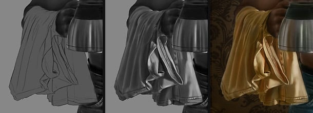
Silk
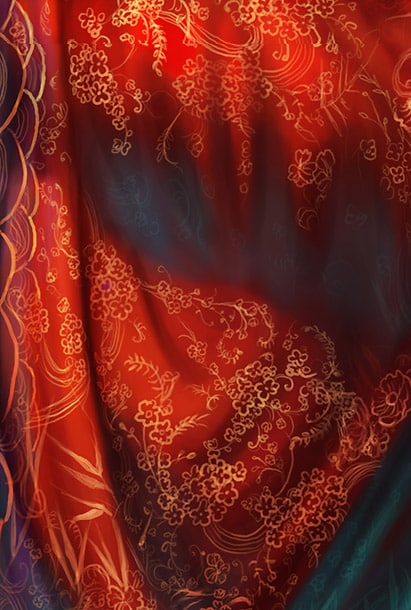
(C) Kay Cee
Silk is a delicate material, and looks beautiful when caught by light, or nicely detailed as on this example by Kulbongkot Chutaprutikorn (kayness). To create the patterns, she used a smallish round brush in one flat colour, and painted the patterns in a separate layer above the layer with the fabrics. Then she went over with a low opacity eraser and gently erased where the folds and shadows are. To make it appear richer, she ticked the “lock transparent pixels” on the layer with the patterns, and went over with a brush set to “overlay” and used a slightly more intensive colour. You can use a brush set to “multiply” where the folds are and where the fabric recedes. At the end, she added another layer on top and painted gently over the whole fabrics to bring it all in together.
Play around with layer opacity and layer blending modes for interesting effects. The “liquify” filter is great to tweak patters to make them follow the shape of the folds.
Category 3: Shiny and reflective materials
Shiny and reflective metal
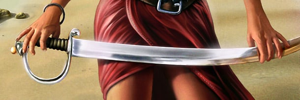
(C) Henning Ludvigsen
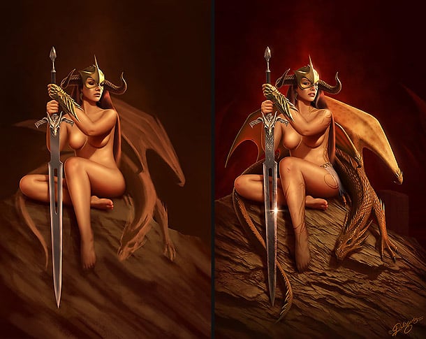
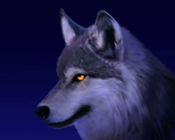
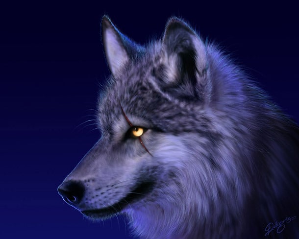
Reflective metal, or chrome, is all about reflections. When working with reflections, know what the environment your object is placed in, and make sure these two elements corresponds. If the environment is different than the reflections on the object, then the object will not seem to be a part of the image and look off. Getting into painting reflections is a massive study and can be hard to comprehend. Therefore, use references, to see how the reflections are behaving. Strong high-lights are naturally important when painting chrome. Make note of how the fingers reflect in the shiny blade in this example; a tiny detail, but still an important par to the overall impression.
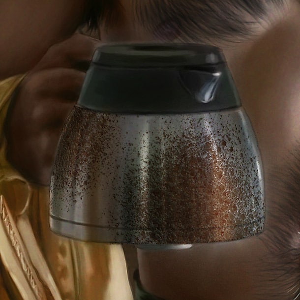
Brushed metal
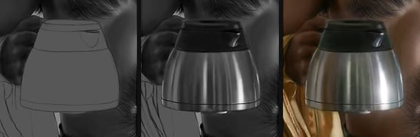
(C) Henning Ludvigsen
Brushed metal is easier to paint than chrome, and you don’t have to go all out and paint every single reflecting object perfectly, but merely hint the reflecting environment using contrast and corresponding colours. For this example, in the end I used the smudge tool set to very low and used my speckled hair-brush to create a vague distortion with horizontal lines along the side of the pot, making it appear to have a brushed surface. Going over with a vague, think brush in the end will make for further detail.
Gold
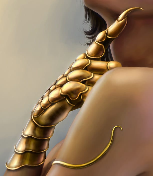
(C) Henning Ludvigsen
Gold works just like painting metal, just with a strong colour overlay. Remember, gold isn’t plain yellow; in addition, use de-saturated colours, like greens, orange, grey, and white.
Category 4: Organic materials
Hair
(C) Natascha Roeoesli
The most important thing about painting hair is that you shouldn’t really paint every single strand of hair. On the other hand, by simplifying you will most probably end up with an even nicer result whilst saving time. On these two examples painted by Natascha Roeoesli, she has simplified the features of the hair quite a lot.
A few important facts about hair:
- Hair comes in layers; start from the back, and work your self towards the viewer.
- Hair comes in chunks; they always stick together and cling onto each other. This combined with single strands makes up for a nice final impression.
- Hair consists of many variations of colour; blond hair isn’t yellow, and brown hair isn’t really brown. They all consist of variations of colours, in addition to influences from the environment and surrounding light sources.
- As a rule of thumb, no matter how dark or bright the hair should be; always start with darker colour as a base, and then work your way towards the brighter colours further out, still working in layers as mentioned above.
Fur
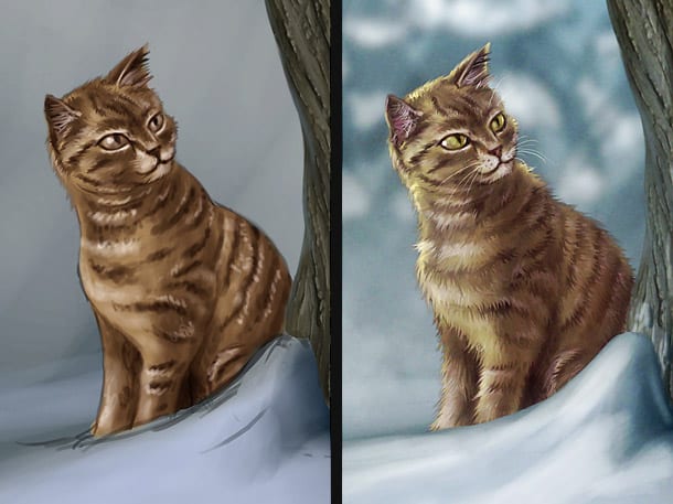
(C) Henning Ludvigsen
The often dreaded process of painting fur can actually become quite easy when following a simplified system like for example this one.
- First, paint the creature with completely flat “fur”. The important thing here is variation in tones, like the dark stripes on the cat in this example.
- Use a speckled hair-brush, and the smudge tool, and start smudging out the fur. Work your way from the back of the creature towards the front. This way you will get the layers in right order, and the different fur-variations painted earlier gets “extruded” into real fur, creating interesting texture. The more variations you added in the previous step, the more interesting your fur will look.
- Go over with a sharp brush, and clean the fur up in places, and add lone strands to break up the smudged look.
Scales
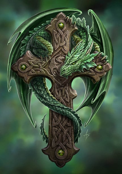
(C) Anne Stokes
Scales should be shiny, and tends to have an amazingly detailed and beautifully composition, so make sure to spend time on putting each scale into system before starting the detailing process, just like Anne Stokes has done on this example. Scales are almost like metal, with pretty strong high-lights. For this, you can use the dodge-tool set to highlights to fine-detail the highlights.
Extra material tips – Painting fur
Step 1 – Lay-out the fur
(C) Nick Deligaris
Painting fur can test your patience, but investing proper time in detailing fur can result in stunning results, just like Nick Deligaris has done on this example. He started out painting a rough, non-detailed base, to decide the lay-out and composition of the fur and its variations.
Step 2 – Detail till you drop
(C) Nick Deligaris
You can spend as much time as you like detailing fur. Start out using rough brushstrokes, working in patches of fur. Remember that fur is similar to hair; they come together in batches as they cling together, and almost looks like pointy spikes from a distance. Then go over again and again with thinner and thinner brushes until you’ve reached the point of details you’re aiming for. Nick also added a beautiful rim-light, as fur and hair catches light that shines from behind. Taking advantage of rim-lights is a good way of softening up your painting, making for a lot more interesting and professional looking final expression.
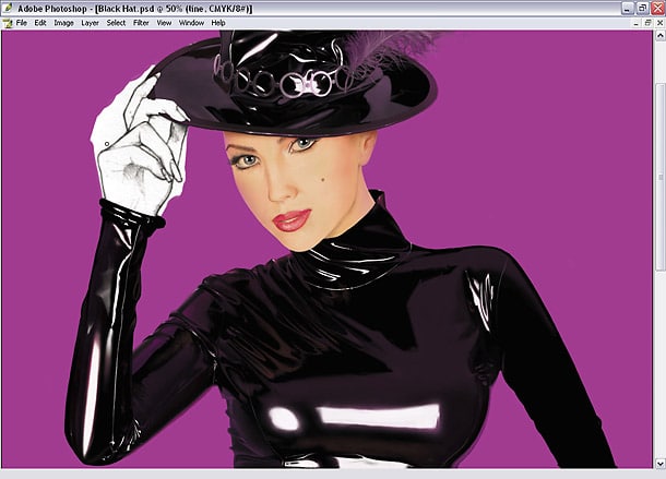
Extra material tips – How to paint latex
Step 1 – Get basic shape up
(C) Vincent Hie
When Vincent Hie is painting shiny materials, like for example latex, he makes sure to first have the basic shape up. This also works for shiny plastic. As this is latex, he started off with a hard brush with maximum level settings. Be sure the overall shape is correct before putting in secondary reflecting colours. Vincent is using the lasso tool to mask out the areas he is working to be able to move the folds around in its layer to where they work best. He is also using a pinkish colour for the reflecting layer to link it to the background. Be gentle with colouring though in this stage, you want to maintain that (black) base colour look. Make some interesting looking lines and wrinkles, and make sure those patterns follow the wrinkles and creases in the fabric.
Step 2 – Add highlights
(C) Vincent Hie
Highlights have been added in a new layer, and pure white is needed for this specific expression (or the colour of the light source in the “scene”). A hard pencil brush is preferable. For the bigger highlights make a layer underneath and make a glow using a soft brush. Contrast is the key, and pay attention to the clean levels of colouring; almost pure black, a pretty sharp transition to a middle yet dark value, and then a big hard leap to pure white. And more middle values will soften up the material and create a different expression.
Step 3 – Think in shapes
(C) Vincent Hie
The right arm is completed. As you can see the highlights are now long small and vertical. The more curved the surface is, the smaller the highlighted surface is. Always look at references when doing this, and imagine what the shapes are like and what angle the light source is according to them. Latex is an all-or-nothing fabric when it comes to reflecting lights. Be careful with the highlights though, use this only sparsely which will result in a more effective look. Paint as neat as you can; sloppy painted latex or plastic will stand out immediately.