Know your values
Make your values balanced by implementing some very simple rules about light and shadows in your already existing work-flow.
There is a whole lot of theory when it comes to creating art, and it’s up to each and every one of us how much of this we want to put into action when painting, rather than rely completely on our artistic sense. There are no definite answers to what is the best way of working, but I doubt that anyone will deny that a healthy mix between using both our artistic sense and the rules of theory will get you a long way.
When taking an art education, or even a short art course, you will most likely have to go through repetitive rounds of practicing values. I remember at my art school, we would spend months just painting and drawing what we at the moment thought was boring still-life set-ups with white boxes, spheres, cones, and drapes, placed in front of a white background and lit with a desk lamp. By doing this so extensively, our teacher would make sure that we understood the importance of values, and the fact that even plain white objects do have a lot of shape and personality and that you need to work to add shape to texture-less objects. In retrospect I know that we learned a lot from these sessions and understand the importance of it.
Values are what will create depth and focal points in a piece. No matter how much intricate and beautiful detail you’ve spent days or weeks painting; your piece will still look flat or confusing if your values are off. You should either make sure to start off in grey-scale to establish a solid base with your values, or checking your values in grey-scale throughout your entire creation process to make your final result as good as possible.
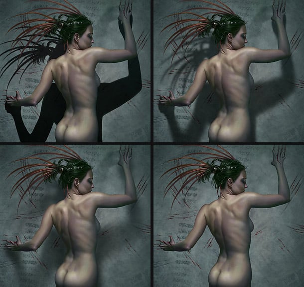
Video, short time lapse version of the creation of “Owner”
Video, long version of the creation of “Owner”
01 – About values
Roughly speaking, value can be more important than colour. A piece with a nicely composed range of values will still work even if the colours are off. When we are limited to 2D, all we have to depend on to create depth is taking advantage of values. This is quite simple to do as long as you check them throughout your painting process.
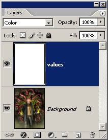
When painting, keep a layer on top filled with 100% white, and layer mode set to “Color”. This way you can easily check your values as you’re painting.
The ones that prefer starting off in greyscale will naturally have an easier job handling the values. A good tip is to make sure that you’re using a neutral value for the background; avoid black or white as this will influence the way you see your values whilst working.
02 – Light values and contrast for points of interest
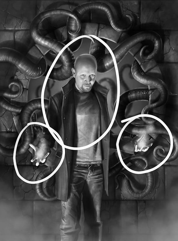
You can control where to have the points of interest in your painting by keeping those areas with the brightest values and with the most contrast. Areas placed in shadow or painted with low contrast will naturally seem easy on the eye and not pop as much as contrast and bright values. This is a very simple thing to forget about, especially when focusing on colour. On the good side; it’s just as simple to apply when remembered, even late in the process.
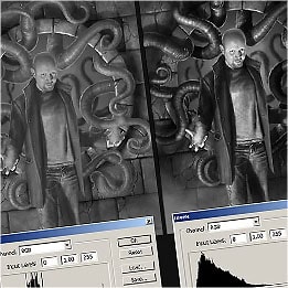
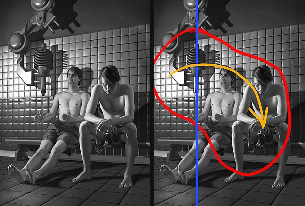
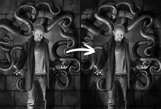
03 – Balance your values
You need your values to be well balanced to make your piece easy to read. A painting with wrong or too evened out values will appear dull and flat (left example). By keeping the majority of your values within the midrange values and the remaining values for contrast and detail, you will notice that your piece is in balance and easier to read (right example).
Should you have a painting with a majority of very bright values, make sure to include the opposite as well; dark values to maintain the whole range of values and balance in your piece. This goes both ways; dark needs light, light needs dark.
04 – Shadows and highlights
When painting in 2D, shadows and highlights is what you have to work with when creating depth. Being able to understand light and shadows is important, and this is a big part of working with values. To place an object or a character on the ground or in front of a wall, you need a shadow to give the character a placement in space, and to give the 2D painting a feel of 3D. You can choose your expression by using hard or soft shadows, and also the direction of the shadows. Correct use of shadows and light can create a lot of depth and also influence the expression and feeling in the piece.
And remember; Sharp shadows and intense highlights will naturally create a more dramatic expression; whilst softer will appear calmer.
05 – Value with emotions
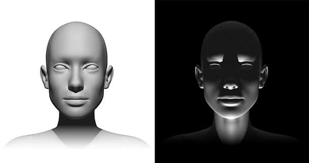
The very same object can show two completely different emotions simply by changing the light direction. In this example, both of the faces are pretty much equally balanced even though they are at opposite ends of the value scale. Still, they appear as complete opposites, emotion-wise.
06 – Composition with values
Before settling on your composition, make sure your piece is nicely balanced value-wise in addition to colour. Move your elements around in grey-scale and find the best placements so that the points of interests are where they should be for your piece to work. Try to capture the flow of the composition, which elements will attract the eyes of the viewer and how it will lead the viewer though the piece. Adjust the values of the back and foreground elements so that the balance is even and you have the entire range of values included in your piece.
07 – Practical exercises
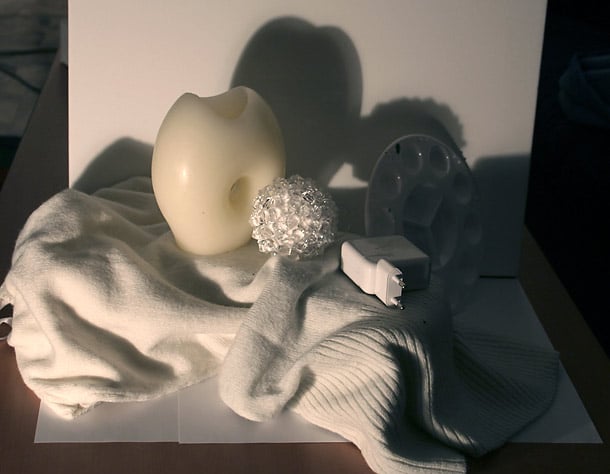
There is no way better than learning how to do anything than going practical. Set up your own little still life on your desk or the living room table and blow the dust from your old sketchpad and pencils. The still life scene can be assembled from things in your house. Make sure to use a white background and base, and stack white objects in all shapes and sizes to create challenging scenes to draw. Find a desk lamp to light up your scene, and turn off all other light sources in the room to make sure that you have one consistent light direction.
08 – Creating a piece, getting the base up
Ok, so let’s create a simple piece of art, keeping some of the things mentioned before in mind and implementing them into the creation process.
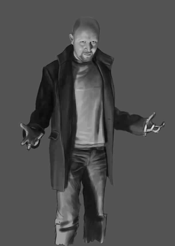
When painting the main character, or object, try to keep the lighting situation interesting. Shooting reference photographs with a camera flash is a bad idea as the frontal light will make the person or objects appear flat, artificial, and boring. Having the light set from an angle will create a completely different mood and make the piece a lot more interesting. The best thing is using fully natural light in your reference pictures, even though that’s usually harder to control. Also, by having dramatic lighting situations, shadows will be playing an important role, and add depth to your composition.
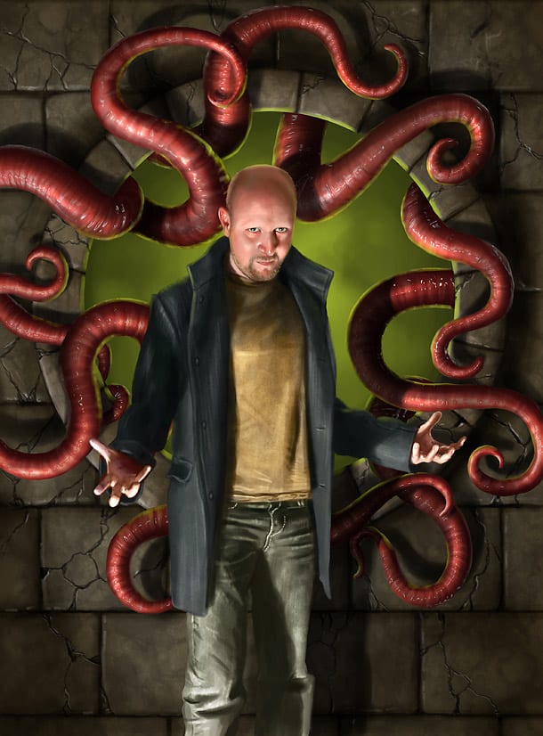
For this piece, I wanted to use a semi dramatic lighting situation, and chose to have the main light source emitting from the bottom left of the canvas, casting some shadow on the character, but not too extreme so that his facial features are still fully lit and visible.
09 – Creating a piece, composition
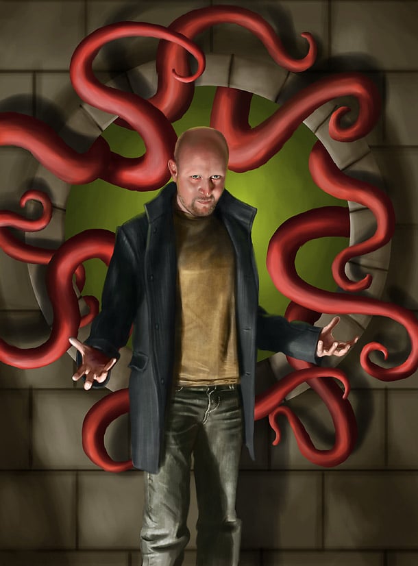
Try thinking ahead when composing your piece. I wanted to keep this one pretty much symmetrical and quite simple, and was planning ahead to add some shadows on the walls around cast by objects out of sight. I did this to emphasize the important parts of the piece, which would be the main character.
I also added a quite bright and saturated green background colour behind the character to add even more contrast to the character. The contrast between the background and the character will draw attention to the eye both contrast and colour wise. Also, the green colour works as a complimentary colour to his skin colour and the colour of the surrounding red tentacles.
At this step, check your values. This can be easily done by adding a 100% white layer on top of the stack, set to Color blending mode. This way it will display your piece in grey-scale without the chance of doing any errors by converting the mode of your painting.
10 – Creating a piece, tentacle details
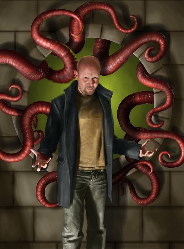
The tentacle is the second important “character” in this piece. It’s important not to give the secondary characters or objects too much contrast as they will create conflict with the main element. I added some small, yet sharp highlights to the tentacles to make them appear wet and a bit glossy. These details will also work as attention seekers, but by keeping them vague; they won’t get out of hand and demand too much attention.
The wet slimy effect was created by copying the tentacles into a new layer, converting the layer into grey-scale, and applying a plastic wrap filter. By setting the layer blending mode to “Pin Light”, the highlights in the layer will fit the colourized version underneath and appear wet. This grey-scale layer can be post edited to control the highlights and remove filter generated elements that doesn’t look good or natural.
11 – Creating a piece, more details
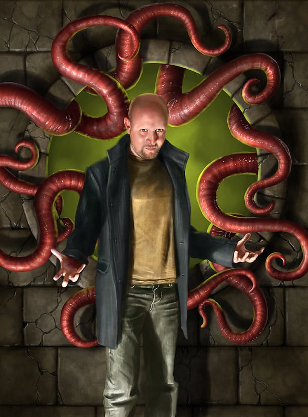
The wall behind was made too bright on purpose. Now it’s time to add some more detail to it. First, I made a multiply layer on top and added some noise with a textured brush. By setting the layer to multiply, it will add darker values to the already existing values, and not go any brighter. This is why it was a good idea to keep the base a bit brighter than expected. I also added some cracks in the walls to give it some more details. I used a new layer set to multiply and a vague Bevel and Emboss layer style to add some depth to the cracks. I manually edited the cracks with a normal brush afterwards as it looks too artificial when left untouched.
12 – Tentacle shadows
Now, the tentacles has got a decent base with details and some shape, but they still lack some self shadows to make up the shapes and to make the piece more interesting. I created a new layer above the tentacle layers and set the layer blending mode to multiply. By adding a “Layer Mask” to this layer and then transferring the tentacle outlines to the Selection map, I can easily paint the shadows on the tentacles without the risk of painting over any existing layers. The cool thing about layer masks is that you can’t draw outside the shapes of the tentacles.
To transfer the outlines of the tentacles to the layer mask, first make sure that the layer mask is black. If the new thumbnail to the right in your layer is still white, simply click on it to mark it and fill it with black. Now, hold CTRL and click the layer where you want the outlines transferred from to get an active selection. Now, still with the layer style selected, fill your active selection with white.
13 – Empathizing the character
Since the background is quite flat at the moment, it’s a bit difficult to read. I added a new shadow layer as I had planned from of the start to “frame” the piece a bit more and suppress some of the medium values that are making the piece dull. By doing this, I will empathize the character as there are less distracting middle tone values around to steal attention. Even if the background now actually have more contrast and variation, it still seem calm but at the same time serving a purpose.
14 – Creating a piece, more details
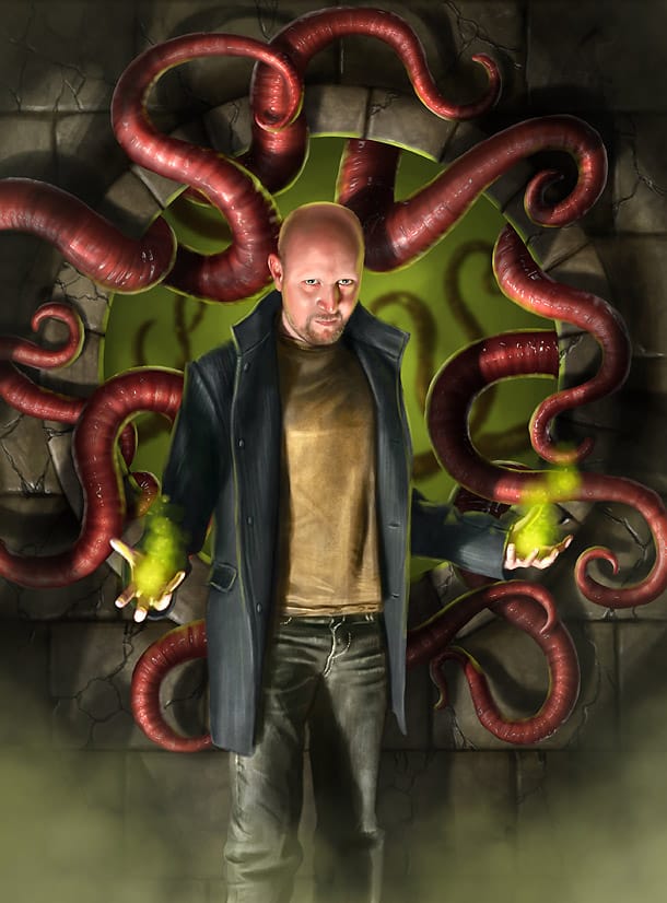
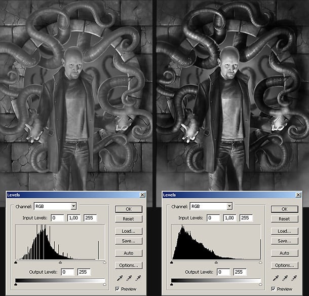
At this step in the progress, it’s very important to check the values again. Turn on your values layer to display your piece in grey-scale, and try to see how balanced it is. For this piece, I needed to add some more contrast to the character, so I opened the brightness/contrast dialogue and beefed up the highlights a bit to separate him more from the background.
I also added a layer between the character and the background where I added some soft fog; this to separate the character even more from the background. It’s important not to take this too far as you can easily separate your character from the background completely. A good way to make sure your character belongs in the scene is to add some kind of element or special effect in-front. I added another layer with soft fog at the bottom, in-front of the character’s legs to make it appear as if he is standing knee deep in green fog.
15 – Creating a piece, final details
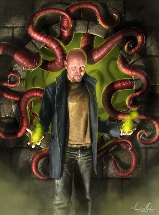
When looking at the piece, and especially in grey-scale, I decided to add some more texture to the background. I used a simple textured noise brush and added a new layer of multiplied noise. As multiplying makes everything darker, I wanted to bring the values back up again so I added a second noise layer with the blending mode set to “Color Dodge”, and scattered some bright noise around as well. The tentacles needed a bit more attention too and so did the texture of the outfit of the character.
Pro tip 1 – Quick value check
Keep a layer will with 100% white on top of all your layers, and set the layer blending mode to “Color” to check your values quickly while working. By doing this, you can quickly keep in control of your values. Remember, when your piece works just as well in grey-scale as in colour, you’re heading in the right direction.
Pro tip 1 – Keep your high-res images to yourself
With today’s easy access to the internet and all the content out there, it’s important to take care of your high resolution art work files and consider them your “originals”. Even when working for clients, make sure never to give away any full resolution versions before the deal has been settled. By posting high-res images online, there will be people taking advantage of this either by selling prints of your work or selling art compilation DVD’s for others to use freely.
Pro tip 2 – Save your process for several reasons
Save your progress steps during your painting process. If you have enough disc space, keep saving new numbered copies of your layered Photoshop or Painter file. This works both as a safety precaution against corrupted files, and might also be handy to have for future reference when writing tutorials or if you have to prove that you are the rightful owner and creator of your painting, which tend to happen from time to time when being active in online communities. If you’re having limited disc space; simply save numbered jpegs in max quality.
Photoshop shortcut tips
Easily copy layer
Hold ALT while dragging objects in your view-port with the Move tool. Handy for easily copying elements while placing them in the same round.
Select layer by clicking
Hold CTRL while clicking on view-port elements with the Move tool to select the belonging layer. This is a good shortcut if you’re working with tons of layers and have limited overview of them all.
Select multiple layers by clicking
Hold CTRL and SHIFT to select multiple layers by clicking on view-port elements using the Move tool.