Final refinements
Achieve a professional finish to your art by adding a couple of simple tweaks at the end of your workflow.
(C) Henning Ludvigsen
We all strive for perfection in our art, and sometimes it’s hard to know what to do to achieve that very special expression we’re aiming for. Sometimes it doesn’t need much to achieve a professional look to your artg; you simply need to know what to do to get there. It’s very easy to label your art as finished when you could have taken it several steps further.
When dealing with digital art, there are also technical aspects that you will bump into; like what resolution to work with, and how to deal with file formats in the end.
Concerning Pixel Sizes and Resolutions
If you want to raise your knowledge about pixels, sizes and resolution further, then let’s listen to professional designer and illustrator Ed Hall putting it down to simple terms.
![]()
(C) Ed Hall
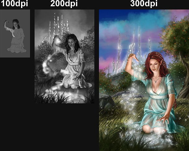
Images can have the same pixel dimensions, but different printing-sizes and DPI.
– It has become a common misnomer that the higher the resolution the better the quality of the image. Although resolution has a huge part of the final outcome of the image, it does not impact the quality as one may think it does.
The first thing to understand is that one must separate the notion of DPI and PPI. DPI or “Dots per Inch” is the amount of ink that is placed on the paper when printing. The PPI or “Pixels per Inch” is the amount of pixels that are used in an inch when on the screen. Remember the size of the pixel will always be the same, but a Dot of ink can change from printer to printer.
(C) Ed Hall
The quality doesn’t change at different resolutions but only when you change the pixel size.
If you want a poster sized print then plan ahead, and either set your Pixel Dimensions large enough to fit the poster (or larger) or set your resolution high enough that if the image is scaled the quality isn’t lost when the pixels are resized.
Average resolution is 300dpi for most graphical images. But this resolution is not always needed. When starting, check with the printer to see if 300dpi is really needed. You might need only 200dpi or in some cases more.
If you have to change the size of the image (the PPI) to fit the paper you’ll begin to lose quality of the image.
As long as the pixel size is not affected then you can adjust your resolution to various degrees without affecting the quality of the image.
To save yourself trouble at the end trying to get the image to look its best at the correct resolution, just remember to set it up before you start. If you are unsure, then work larger. It is much easier to scale down than it is to scale up.
Optimized start-up
(C) Henning Ludvigsen
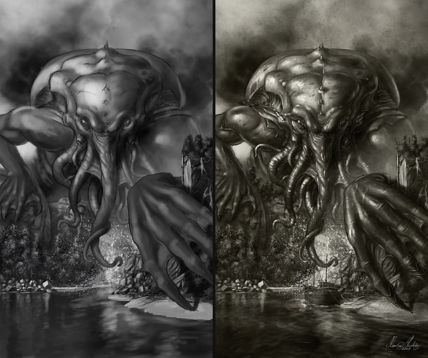
Now that we know a bit more about resolution and sizes, it’s time to start painting. When sketching, the most important thing is having a fast frame-rate to avoid annoying computer-lag which can make your creativity suffer. One way around this is starting off in lower resolution, using the physical (printing) size measures you’re planning on ending up with; for example 72 or 100dpi.
Once the sketch is up, in the Image Size dialogue, change the dpi 200dpi for the blocking in and first round of detailing work whilst keeping the “Resample Image” tick-box active. This is to scale up the amount of pixels and information in your piece into a bigger and heavier file. Then turn it up to 300dpi before the very final round of detailing.
Add a final touch
Sometimes only a minor detail can separate a professional looking piece with a new-beginner. Be it the final round of detailing, texture overlays, rim-lights, colour-tweaks, or adding some atmosphere and softening.
Add a final touch – Premature finalization
Often seen with new beginners to digital art are paintings that could need another round of detailing. The urge to finish the piece for showing it to the world can be very strong when you’re eager, and the final, often much needed touch is lacking making the overall composition suffer. This is often visible with clean surfaces, which should clearly be detailed out, either with textures or shading to add more richness to the piece.
Add a final touch – Refinements and texture-overlays
(C) Henning Ludvigsen
There’s something about grey-scale sketches; they can be tempting to wrap too early. Try adding a last round of details (still rough) by using a thinner brush and you’ll see how it suddenly springs to life; it doesn’t take much. And why not add a vaguely tinted and textured surface to those boring grey-scale values in the end?
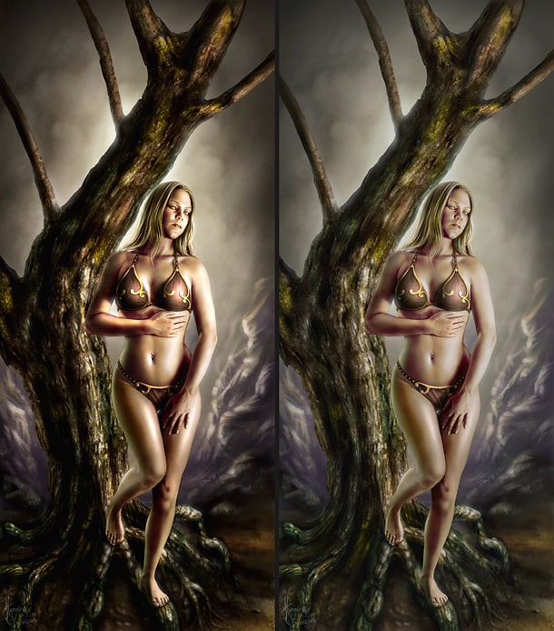
Add a final touch – Flat composition and depth
(C) FFG / Henning Ludvigsen
A beautifully rendered piece can still appear as if it’s lacking something, if the depth is lacking. Painting elements found in the distance of the painting using the same values and chroma (colour saturation) as elements close to the viewer will make the painting appear flat and hard to read. By de-saturating and adding less contrast to elements further away from the viewer, you’ll achieve depth, which can often be done easily by simply adjusting existing layers. Copyright FFG.
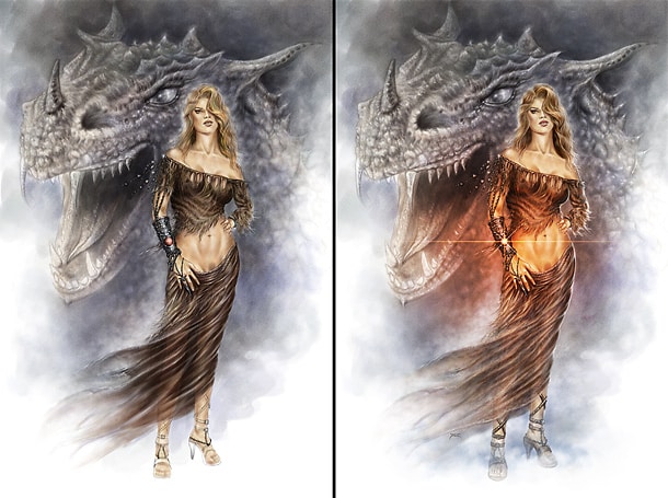
Add a final touch – Side aligned lights for drama and shape
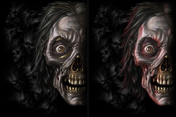
(C) Spiral Direct / Henning Ludvigsen
If you think your character is looking a little flat and boring, then add a secondary, coloured light-source. Here, a red light-source from the left was added to add to the dramatic expression, and to exaggerate the shape of the zombie’s head. Copyright Spiral Direct.
Add a final touch – Add rim-light for contrast
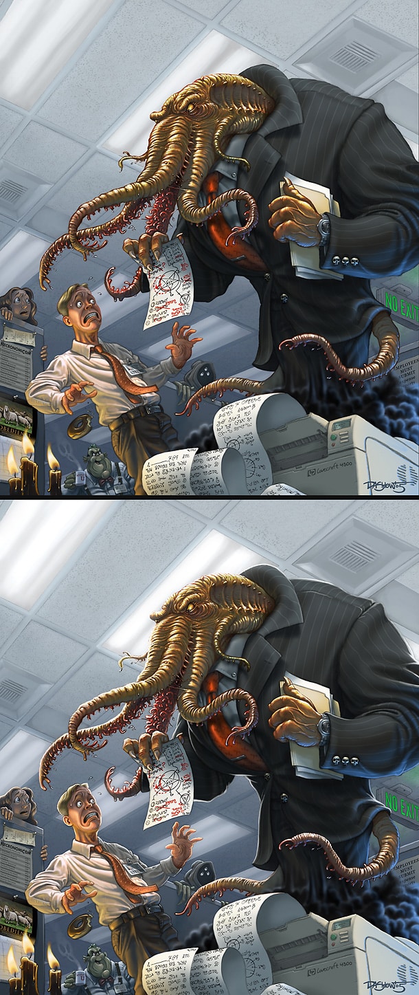
(C) Michael Dashow
Look closely at the silhouettes of these characters painted my Michael Dashow. Theoretically, this work pretty much the same as adding side-aligned lights, but should be used more subtly and will still make a big impact on the final perception of the painting. This is specifically handy if you need to add more contrast and to connect your characters to the surroundings.
Add a final touch – Confine your highlight and shadows
(C) Henning Ludvigsen
Yes, highlight and shadow creates depth and shape, and in the beginning it can be easy to take it a bit too far. A standard mix between dull and extreme is safe, and throw away that dodge and burn tool. Avoiding 100% black and white is a good start as well.
Add a final touch – Metal reflections
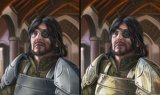
(C) FFG / Henning Ludvigsen
Metal can be tricky, and can be tempting to leave under prioritized. Spending a little time and effort adding some actual reflections and highlights into the metal pieces in your composition will make a difference in the end. Here, a simple chrome filter was blended with the basic armour pieces to create metallic effects within minutes. Copyright FFG.
Add a final touch – Breathe life into flat cartoon characters
(C) Henning Ludvigsen
Unless you’re aiming for a simple approach, adding simple shadows and highlights to cartoon characters won’t take much time, and it’s great fun too. Also, tinting the line art according to its belonging blocked in surface will result in a softer and more professional impression.
File formats
PSD (Photoshop Document)
PSD is Photoshop’s native format. Use this to save your layers, text layers, adjustment layers, clipping paths, layer styles, etc. If Photoshop is your painting program, keeping your “original” file with all layers intact as a PSD-file is highly recommended.
JPEG / JPG (Joint Photographic Experts Group)
JPEG is best for keeping the file-sizes of the images small, and is the best choice when putting your images online. The JPEG compression is lossy, which means that any crisp lines (especially sharp text) can blur a bit. Still, having JPEG images saved in high resolution and MAX quality probably won’t show that much on print. This should, however, be avoided in top of the range printing materials.
EPS (Encapsulated PostScript)
This format can be used for both vector graphics and bitmaps. This format is widely used in the graphic-design and printing industry because of the support of both types.
TIFF (Tagged Image File Format)
TIFF is good for any pixel-based image, and is often considered the safest and best choice for sending away your high-res images for print for best quality. TIFF has an LZW compression option with non-lossy compression, which is good for sending larger files over the internet with no loss in quality. Still, be careful and make sure the receiver knows about the LZW compression as some equipment might print separate coloured TIFF’s as greyscale.
BMP (Bitmap)
BMP works pretty much the same as the TIFF format, except that it doesn’t come with a compression option. Most printers prefer TIFF’s over BMP’s.
GIF (Graphics Interchange Format)
GIF should be used for simple web-graphics with limited colours. The maximum palette of GIF is restricted to 256 unique colours, or less, and can therefore be tailored to fit the amount of colours used in a graphical web-element for fast loading graphics for the web. This format should not be used for printed materials. GIF also supports 1-bit (hard, edged transparency), and animation.
PNG
Use this format for smaller file sizes with no loss in quality. This is a good format for web graphics as it supports alpha transparency, which means full soft transparency as it exists in a layer in Photoshop, for example. This format is not widely used for printing materials.
Colour modes
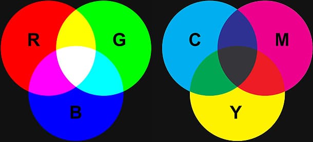
Here you see two colour models; the RBG-model (screen colours), and the CMY-model (Cyan, Magenta, Yellow, printing colours.). Because the mix of all three CMY colours only results in a muddy brown colour, a fourth Key-colour (black) is added to compensate for these impurities.
The major difference between the two is that the RGB colours consist of light, which is how your screen is displaying colours. The RGB-model displays a much larger percentage of the visible spectrum than the CMYK-model, and therefore has a wider gamut. It’s important to be aware of the fact that you can see and work with colours in RGB that are impossible to get on print.
Photoshop gives you a quick and rough CMYK preview by pressing Ctrl+Y, but this is far from a reliable calibrated preview and should only be used to point out extreme changes in colours that are out of the CMYK colour gamut.
Most digital artists recommend working in RGB mode, simply because this is how your computer and screen is handling colours. Because of this, it’s important to do colour proofing when sending away your work for printing. You art WILL look different on print than on your screen, that’s simply the way it is. The only way of minimizing the difference, is by purchasing screen calibration hardware.
Extra tips
Add attention and focal points
(C) Uwe Jarling
If your painting seems a bit dull and flat, it still might not need much to make it a lot more interesting. In this painting by Uwe Jarling, he added a simple, saturated glow around the bracelet, to underline that this is the element of importance in this piece.
When you feel done with your piece, take a step back and evaluate it before putting the last brushstroke. Check that the elements of interest and importance are easy to read, and that the attention towards these elements works in a satisfying way.
Add final effects
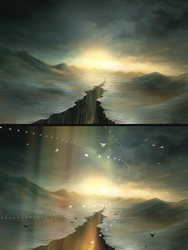
(C) Martin Bland
Adding final, full canvas, effects to your painting is a fast and efficient way of improving the look of it. Here, Martin Bland added some soft beams of light, and some glowing elements to make the piece a lot more interesting.
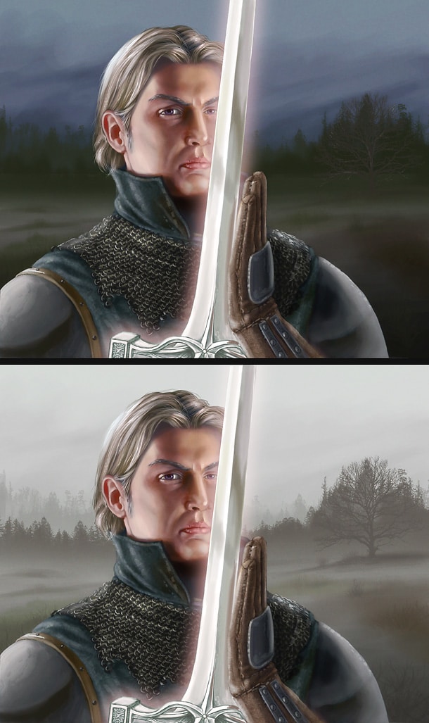
(C) Henning Ludvigsen
Adding a soft glow to your painting is fast, and can help softening dark and harsh-looking paintings. Put a flattened layer of your painting on top in the layer stack, run it through the “Guassian Blur” filter (the amount depends on the resolution of the piece, so simply add as much as you want the glow to be). Then set the layer blending mode to “Screen”, or “Linear Dodge”, and play around with the opacity slider to find the best setting. This will brighten your image, so take this under consideration. Some brightness adjustments afterwards to the underlying layers can be done to compensate this.